

The Roads of Rome, the Silent Epidemic and Waffle Chores
The Roads of Rome, the Silent Epidemic and Waffle Chores
Edition #3 of The Datavist, a weekly newsletter highlighting great instances of data-driven storytelling in the humanities. Compiled and commented upon by Darragh Murray.

Good morning/afternoon/evening datavists!
Yes, now I've also decided to call everyone who reads this newsletter (and perhaps data visualisation fans in general) by the same title as the newsletter itself. I'm unsure if that's the epitome of arrogance or just plain silly, but let's just roll with it for this week. I hope you're all doing well in your respective corners of the globe.
Anyway, let’s get right into it. Ancient Rome, anyone?
The Roads of Rome and other python-generated geomaps
@pythonmaps | Self-published | 16 January 2021
I came across these via the /r/dataisbeautiful subreddit and was immediately intrigued. Reddit and Twitter user @pythonmaps have been using Python's mapping capability (specifically matplotlib, numpy and geopandas) to generate fascinating maps that communicate valuable historical knowledge to the viewer.
Case in point is this first map on Imperial Rome's road network:

While I knew the Roman Empire was large (and obviously of huge historical significance), visualising the empire in terms of its road network is a stroke of genius as it neatly gives learners deeper knowledge of the huge scope of the empire.
You should definitely follow @pythonmaps on Twitter if you want to see more of their great geomaps (such as this exploration of the water ways of both Africa and the United Kingdom).
The Silent Epidemic: HIV/AIDs in Sub-Saharan Africa
Liz Bravo | Self-published | 15 January 2021
This week's #MakeOverMonday project (the weekly social data project which allows budding data visualisation professionals to develop their skills using interesting datasets) concerned a very sobering topic - the ongoing HIV/AIDs epidemic in sub-Saharan Africa.
The dataset for this week concerned how HIV/AIDS continues to be a huge problem for the African continent and tragically not only seems endemic to the continent's young people (those aged between 10 and 19), but the burden of the disease is disproportionately carried by women.
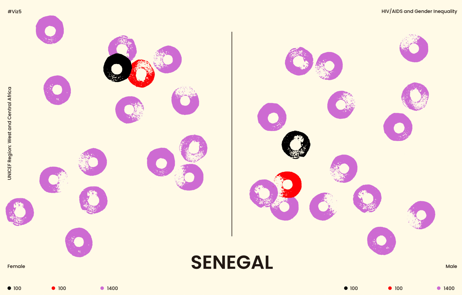
There were many powerful visualisations of this data, but none more than this series of block-printed dot plots by Liz Bravo, which if I understand correctly, were created using actual blocks and paint before later being digitised.
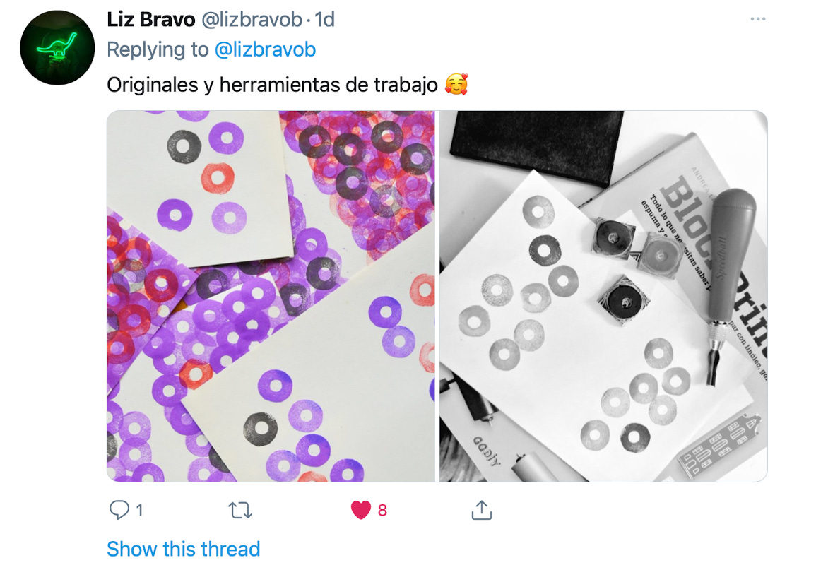
Liz used block printing techniques to visualise the numbers of people suffering from HIV/AIDs in each country in Sub-Saharan Africa, splitting the canvas by gender. This resulted in some compelling charts. I've picked two contrasting examples below: Senegal and South Africa.

Liz has posted the full deck online and I encourage you to have read through.
I don’t want to go overboard with my gushing here, but the amount of care and time that went into creating this series of visualisations must have been significant. The visualisation communicates a powerful story about the gendered nature of the burden of disease in this part of the world using techniques that require minimal use of dedicated visualisation software. It’s beautiful.
Cleaning with waffles
Amy Cesal | The Nightingale | 15 January 2021
I absolutely loved this detailed blog post on The Nightingale by Amy Cesal about how she visualised household labour division between herself and her partner.
Amy and her partner spent some time collecting data on the chores they completed to better visualise who did what over a month.
Once they collected all the data, they visualised them using a waffle chart (as opposed to the chore wheel technique which originally inspired the blog post) - which Amy reasoned was a far better way to get a sense of the work each of them do (which I wholeheartedly agree with).
Here’s a quick example taken from Amy’s article.
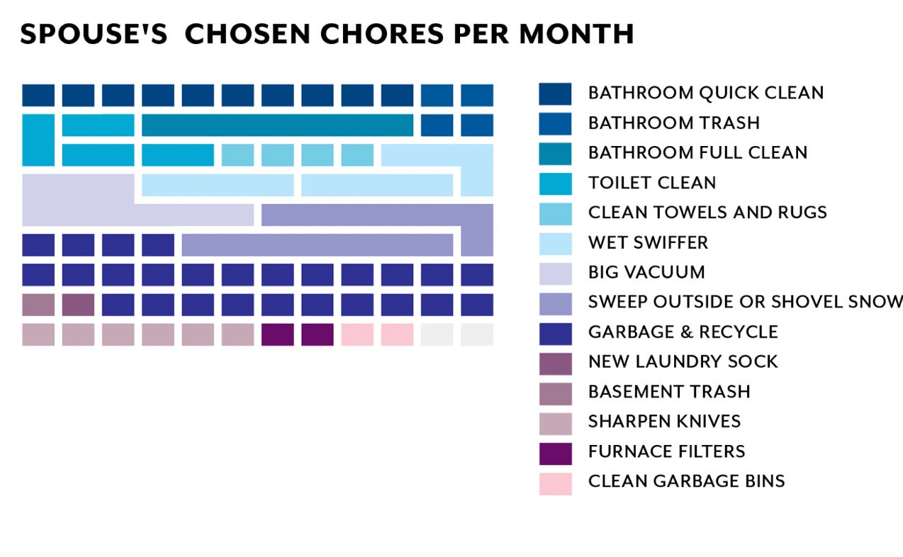
Maybe I’m just very naive, but I have no idea what a ‘wet swiffer’ is!
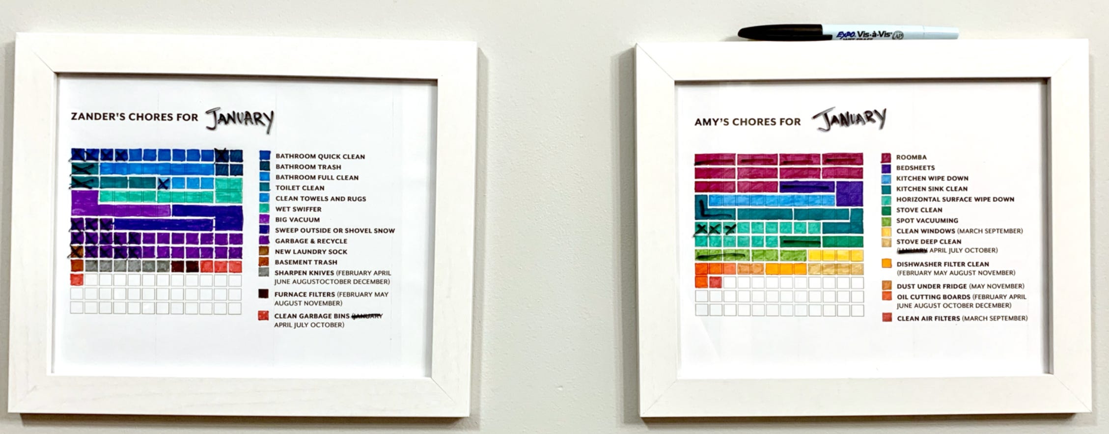
What were the results of this process? Here’s what Amy thought:
Printing out and coloring the chore charts helped us physically connect to the routine. They are framed and on the wall so we can cross off tasks as we accomplish them!
Again, I encourage you to read the full post online.
You might be thinking “well, Darragh, what does this have to do with the theme of your newsletter?”. Well, I don’t think it’s a stretch to say that this type of visualisation of housework tasks does fit into the ongoing analysis of the gendered nature of housework.
While it seems Amy and her partner have a pretty good split of household tasks, we do know that for many others that this is not the case. I think these types of visualisations may be actually a great barometer for deepening people’s understanding of this phenomenon.
——————————————————————————————————————
Well, we’ve made it to the end of Edition Three of The Datavist.
Thank you to all the incredible authors featured in this week’s edition and thank you for making it this far. If you’ve got a second, I would love if you could share this post with colleagues or friends via whatever method works for you.
If you’ve come across this post organically (i.e not through the mailing list) but you’re interested in receiving the newsletter weekly, please feel free to subscribe by plopping in your email in the box below.
Thanks again and have a lovely week!
Darragh