


The history of women's suffrage, the Chinese arms industry, and buying Big Macs: how many working hours does it take?
Welcome to Edition #8, the 'fortnightly' glance at data visualisation in the humanities collated and commented on by Darragh Murray.

Greetings Datavists! And welcome to Edition 8 of The Datavist newsletter - a newsletter dedicated to covering dataviz in the humanities.
It's been a bit of a long wait between drinks for this supposed fortnightly newsletter. A bout of illness, followed by a triathlon _and_ a holiday, followed by a significant birthday, kept this edition permanently sitting in my 'drafts', well, until now. But I hope the wait was worth it.
My work has kept me somewhat aloof from what is going on in the #datafam for the last month. I've essentially been getting deeper into learning the statistical programming language of R (specifically TidyVerse), as I mentioned in the previous edition - a skill I would now highly recommend to those who have to do a lot of data wrangling.
But, I did get some time to have a poke out into the wild world of data visualisation to bring you a few humanities-related (or adjacent) projects that caught my eye.
Let's not waste any more breath and jump straight into looking at women in history.
Women's Suffrage
Kimly Scott | Tableau Public | 8 March 2021 | History
I always enjoy the work of Kimly Scott, a fellow Australia analytics and data visualisation professional. This month Kimly chose to visualise the history of women's suffrage as part of Women's History Month.

In this visualisation, Kimly asks, "when did women around the world win the right to vote?", then proceeds to answer this question using a bee swarm chart but utilised like a timeline (may I call it a swarm-line?), with early female suffrage history starting at the with the year 1838 at the top.

Through Kimly's timeline's unique design, we immediately find out a fascinating fact: Pitcairn Island was the first government to grant women the right to vote. Who would have thought?
One extra nifty thing as you scroll through the bee-swarm is that Kimly has gone to great efforts to highlight interesting turning points int he history of women's suffrage, either using a direct callout box pointing to a specific dot on the timeline.

Many individual dots also have further historical information via a detailed tooltip. Kimly also makes use of an easy search box if you want to find specific countries.
The elements all together result in an all-round solid interactive data visualisation that tells a fascinating historical narrative.
How Developed Is China's Arms Industry?
China Power | 18 February 2021 | International Security
We are perhaps seeing the emergence of great power rivalry once again in international relations, with tensions between China and the US seemingly rising a few notches in recent years. While I'm not declaring Cold War 2 just yet, this deep dive into the Chinese arms industry certainly is a fascinating and timely bit of data-driven journalism.
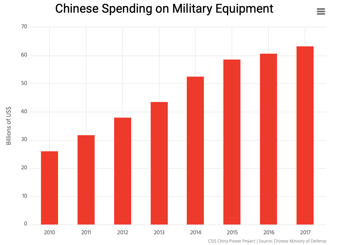
The story covers the rapid development of arms technology in China, which has quickly risen to the number #2 spot over the last 30 years. One intriguing thread outlines how China has managed to skip expensive R&D processes by reverse-engineering other nations' technology.
Some of the visualisation aspects within the story that drew my attention included these bubble charts, with the outside bubble showing the total spend by country and highlighting individual firms and their contribution to the bubble.

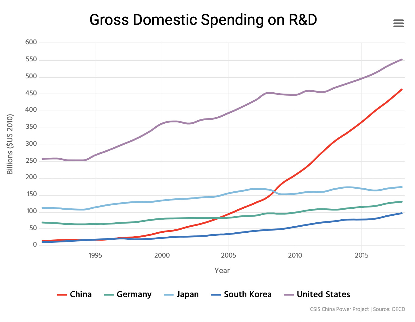
Elsewhere, this line chart's trajectory regarding domestic spending on research and development telling: China is spending boatloads of cash trying to catch the United States.
How long do people need to work at minimum wage to buy one Big Mac?
RJ Andrews / Datawrapper | Datawrapper | February 2021 | Economics
Many will know of The Big Mac index, an index invented by The Economist in the late 1980s to compare purchasing power parity (PPP). Well, here's a little twist on the 'burgernomics' field of study that I don't think I've seen before (probably has been done before....I've just never seen it): specifically how long it takes to earn enough to buy a Big Mac on minimum wage throughout the world.

Based on a tweet by data guru RJ Andrews but re-published in a different format by Datawrapper, this little visualisation shows where other countries sit on the intersection between minimum wage and the local cost a Big Mac. The visualisation consequently allows us to see which countries get a bit of a raw deal when eating McDonald's.
I like how the team at Datawrapper have segmented the scatter plot, providing time 'ranges' that help separate poor/average/great performers on the spectrum of wages v Big Mac cost. You can quickly see that many Latin-American countries get a bit of a raw deal with low minimum wage and the relatively high price of Big Macs!
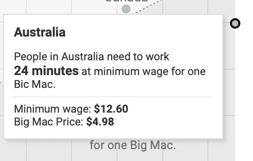
And for my Australian readers, if you're wondering how long it takes over here - you'll only have to work about 24 minutes on the minimum wages before you can quit and grab a Big Mac on your way out.
Lucky Dip
...where I share some other links of interest that don't necessarily fit the theme above...
My fellow data viz aficionado friend from Brisbane, Frederic Fery, has been tracking the obscene amount of rainfall hammering Australia's east coast during March on his Tableau Public profile.
I loved this visual introduction to key machine learning concepts done by Stephanie Yee and Tony Chu using d3.js The duo also do a lot of other great work explaining statistical concepts. Check out their main Twitter feed for more!
——————————————————————————————————————
Phew….well that was a big one! I hope you’ve enjoyed what I’ve collected over the last few weeks. If you like what you read and haven’t subscribed (it’s free!), hit the form button below.
As always please feel free to drop me a line via email (thedatavist@gmail.com) or via twitter (@thedatavist / @dbfmurray) if you have any comments/criticisms or just want to say ‘hey’!
Have a great week!
Darragh