


The history of migration in Australia, the Black Death & allied bombing campaigns of World War 2
This is Edition #7 of The Datavist, a fortnightly newsletter highlighting great instances of data-driven storytelling in the humanities. Compiled and commented upon by Darragh Murray.

G'day, datavists.
Darragh here again with a fortnightly roundup of data visualisation in and around the humanities. I trust you've all been keeping well.
I've had a bit of a crazy few weeks, with my day to day keeping me quite preoccupied (on some great projects, thankfully) and with little time to indulge in continuing my Tableau, Python and PowerBI journeys. I'm now thinking I'm bonkers trying to master all these applications concurrently, but I'm making some progress - particularly in PowerBI.
At the same time, I'm training for my first triathlon of 2021 at Mooloolaba here in Australia, which has meant a lot of time spent parkrunning and indoor cycling on Zwift.
In addition to all the platforms I mentioned above, I've been up to is dabbling in a bit of R again, particularly in developing more data cleansing skills using Tidyverse.
For those data-curious or who have to work with large dirty datasets regularly, I'd recommend digging further into R, particularly via R for Data Science, a gold mine of information for the budding analyst. I've also written a little blog post on taking some baby steps in the Tidyverse, which you can read here.
Anyway, enough about me - let's get into it. First up, I wanted to share with you an excellent bit of data journalism on migration in Australia.
All work, no stay?
Peter Mares, SBS Digital Creative Labs | SBS | 20 August 2018
I've recently been doing quite a bit of analysis work around migration in Australia. I work in international education, so migration is one policy area where my colleagues and I pay a lot of attention.

To broaden my knowledge of the history and impact of temporary migration to Australia, I've been reading Peter Mares' "Not Quite Australia: How Temporary Migration Is Changing the Nation". This book is a very readable account of how temporary migration has an increasing influence on Australia society. I highly recommend it if you're interested in such topics.
At the same time, a colleague of mine reminded me of the existence of this excellent data-driven story on the shifting landscape of Australian migration, written by the Mares and developed in conjunction with the digital team at SBS, an Australian media organisation that focuses on Australia multiculturalism.
Early in the piece features some great examples of small multiple line charts showing the ebbs and flows of European migration to Australia after World War 2. I find them particularly elegant, using a refined palette with a darkened line mark that 'pops' and emphasises the trend.

While here in Australia, Italian migrant culture is visible everywhere (part of the reason we're such coffee snobs), I was quite surprised to learn from this visual of the relatively high influx of German and Dutch in the post-war years, something I wasn't really that aware of before.
It's clear as you scroll through the visual essay that the modern story of migration to Australia is now far more complex. We've long since ditched the horrifying white Australia policy of the mid-20th century and become infinitely more multicultural.
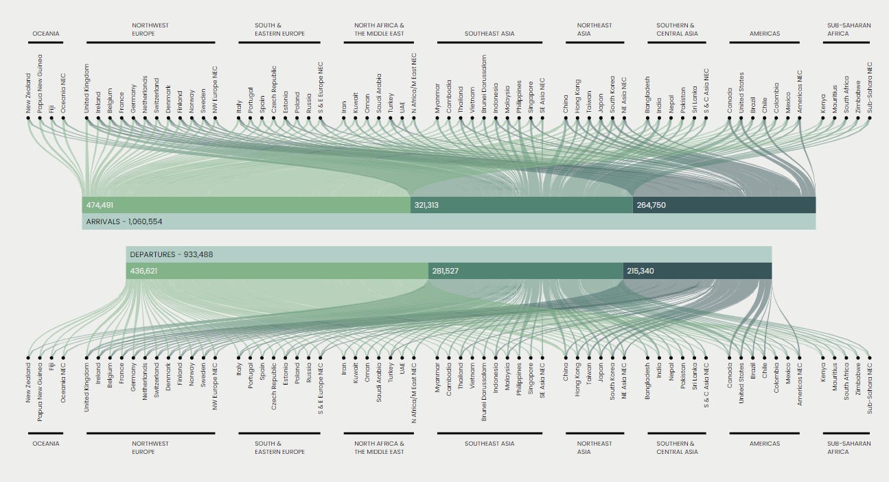
Temporary migrants (such as backpackers, skilled workers and international students) are now a lot more visible in modern Australia society. The flow of migrants to and from the country is quite neatly shown in this comprehensive sankey diagram.
There is a lot more in this visual essay, including a critical discussion of some of the less savoury aspects of temporary migration. Overall, its an enjoyable and comprehensive summary of much of the threads that pervade much of Mares' other work on migration, and it is well worth revisiting.
The Black Death
Alisha Dhillon | Tableau Public | 27 February 2021
There definitely isn't enough history data visualisations. Sure, I'm biased - I did do a university degree in history, after all - but I'm convinced data visualisation is very well placed to explain historical trends in a uniquely compelling way.
Thankfully we've been treated to quite a few historical data visualisations in this month's IronQuest round. And I was particularly drawn to this one on The Black Death (now history's second most famous pandemic) by Alisha Dhillon.

Alisha breaks up her vertical scrolling visual essay into four distinct chapters (causes, the journey, cures and consequences), providing viewers with a neat narrative framework in which to understand the history of this medieval pestilence.
In the journey chapter, Alisha makes great use of geomaps to highlight the epicentres of the Black Death, showing how the pandemic impacted major trading centres throughout Europe and North Africa.

And at the end of the essay, Alisha changes gear, providing some fascinating charts on the economic impacts of the pandemic on the European communities. A true mix of disciplines on display in the one visualisation!
The WW2 Bombing Campaigns of the Allied Forces
Python Maps | Self-published | 26 February 2021
Python Maps continues to deliver the goods. This must be its third feature in this newsletter, but they're producing fascinating and historically intriguing geomaps.
Here are a few quick visualisations of the Allies bombing campaigns during World War 2 that I wanted to comment on. They really give you a great idea of the breadth of the war. Like, for instance, who knew the US was so preoccupied with bombing Italy, or that both Australia and the UK sent planes as far as Iraq and Syria to hit targets.
Here's the first map concentrating on Europe.

And here's the second showing the Allies campaign in Asia.

As always, I highly recommend keeping an eye on the great work Python Maps is doing!
Lucky Dip
Before I sign off, a few data-viz related links that might be of interest:
As dry as it might seem, Jonathan Swabish's new Youtube series "One Chart At A Time" is actually really quite an engaging way to quickly learn the best use cases for particular charts. Jonathan invites prominent thinkers in the field of data visualisation to reflect on all sorts of different chart types and quickly communicate good use cases for particular charts.
This is a great resource for those who are looking to quickly level up their skills in information design (I really enjoyed Andy Kirk's cameo on the bar charts episode). You should also read (and subscribe to) Jonathan's main publication, Policy Viz, a resource devoted to improving data communication.
Judit Bekker, who was featured back in Datavist Edition 5, recently wrote a great blog post on how to effectively use photos in data visualisation. Judit is a bit of a creative genius in this area, and her tips are incredibly handy - particularly for those who wish to up their game when it comes to data viz design.
——————————————————————————————————————
Well, I’m done for this fortnight. Probably a bit longer than I originally intended, but if you made it this far, I hope you enjoyed it nonetheless.
If you haven’t subscribed, you’re welcome to do so. It’s free and means you’ll get it to your inbox each fortnight.
As always, please feel free to hit me up via my various twitter streams (@dbfmurray and @thedatavist) or drop me an email at thedatavist@gmail.com if you’ve got any comments, suggestions for vizzes or just want to shoot the breeze.
Have a great week!
Darragh