Immigrant neighbourhoods, the plight of the Rohingya and more on mass political mobilisation
Issue #2 of The Datavist, a weekly newsletter highlighting great instances of data-driven storytelling in the humanities. Compiled and commented upon by Darragh Murray.
Hello there from my little locked-down corner of the world and welcome to the second edition of The Datavist.
Last Friday, Brisbane - the city in which I live - went into a pre-emptive three-day lockdown after fears that the UK variant of COVID19 may have breached our strict quarantine rules.
So far, it seems, there has been no mass COVID outbreak, but it has meant a lot of time sitting on the couch watching science-fiction movies (I can recommend Coherence) and the cricket. Oh, and of course, researching articles for this newsletter!
With regards to the newsletter, I want to say many thanks to all the new subscribers. When I shared this newsletter's details on social media, I expected maybe a handful of signups, but the response has blown me away.
While I did outline the purpose of the newsletter in the inaugural edition, I'll summarise it again:
This newsletter highlights excellent examples of data visualisation and data-driven storytelling within the broad remit of "the humanities". The humanities may include subject matter as diverse as politics, international affairs, history, philosophy, and so much more.
I think about it like so: if you learned about a topic in a Bachelor of Arts degree, it meets the criteria above. And every week I'll highlight at least three examples of interesting pieces from around the web that fulfil the above purpose.
Anyway, let’s get into the actual content. First up, we’re starting with the United States.
Immigrant neighborhoods shifted red as the country chose blue
Weiyi Cai & Ford Fessenden | New York Times | 20 December 2020
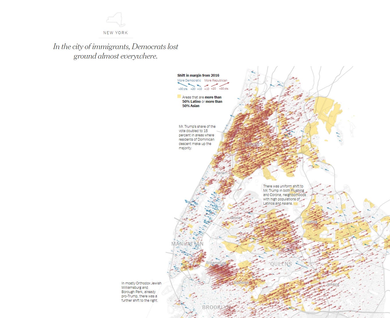
The tragedy that is current US politics often feels a bit overwhelming. However, this data-driven deep dive into voting patterns during the 2020 US Election at the precinct level is worth your time.
In the study linked above, Cai and Fessenden argue that voting data indicates significant shifts in voting patterns in major US cities, particularly amongst Latino and Asian communities. These groups - perhaps unexpectedly - ended up voting for Trump and the Republicans. Cai and Fessenden conclude that these trends indicate an opportunity for conservatives in the US.
Throughout this scroll-telling narrative, Cai and Fessenden zero in on some large cities such as New York, Los Angeles and Chicago and compare voting patterns in 2020 versus patterns in 2016. They cross-reference this data with census information to demographically characterise the different neighbourhoods. They then use geomaps to highlight shifts in voting along with coloured regions to indicate where different immigrant groupings reside.
Shifts in voting patterns in New York City.
It's a fascinating analysis. When I first read it, I found it initially quite challenging quite challenging to imagine migrant communities would be keen to vote for a presidential candidate is so vehemently anti-migration.
However, I acknowledge the large amount of research that has consistently shown that anti-immigration sentiment is often prevalent amongst existing migrant communities within some host countries [see, for example, Mayda (2006), reference below]. Such research may serve as a neat explanation for these emerging voter trends - though reach out if you’ve got an alternate viewpoint, I’d love to hear it.
I came across this article courtesy via another Substack author and polling expert G. Elliott Morris, someone worth a follow if you're fascinated by stats and polling in US politics!
Abandoned at sea: The Desperate Journeys of Rohingya Refugees
Zein, Ying, Kuswanto, Gabriele, Aishah | The Kontinentalist/UNHCR | 8 December 2020
Many years ago, I once shared an Uber trip with a Rohingya refugee who managed to flee Myanmar and travel to Australia to start a better life. I recall him telling me the story of his desperate journey of trying to escape the ongoing persecution of Rohingya. He broke down in tears during the trip, talking about all the friends and family he had to leave behind. It's an encounter that has always stayed with me.
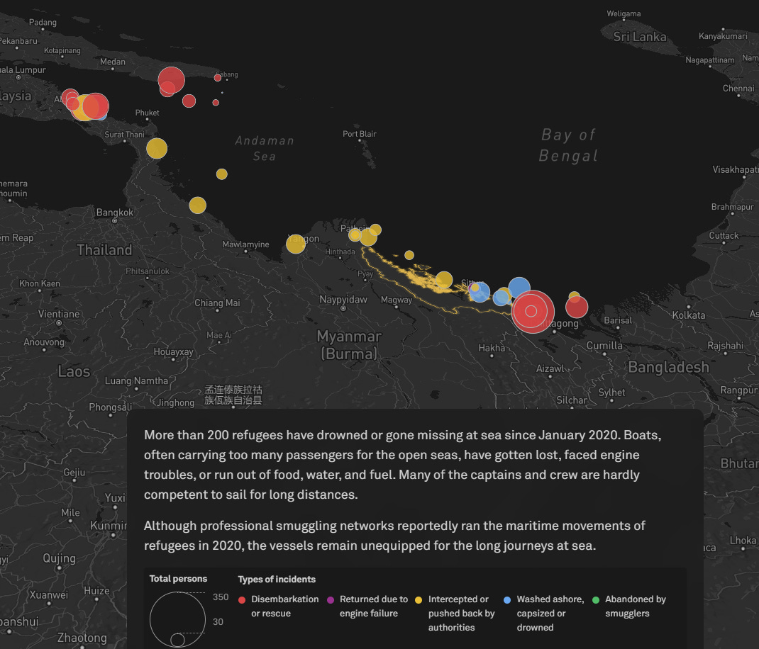
This encounter explains why this I found this recent data-story about the current fate of Rohingya refugees at sea was so enthralling (though undeniably tragic). Another reason was the deft use of data-driven story elements that gives a real sense of the magnitude of the risk and associated peril the Rohingya are forced to confront to escape persecution.
Fate of the stateless: the perilous journey of the Rohingya
Another neat feature of this story is how the authors weave sound recordings of actual Rohingya refugees into the article itself. Alongside data visualisations, such as the Sankey diagram below, these elements combine to make a very compelling narrative.
The article suggests some ways in which readers can help the Rohingya. If you’d like to do so, you can make a donation via the UNHCR.
Mass Mobilization
Mala Deep | Tableau Public | 18 November 2020
Building upon the theme of political activism I shared in the last edition (and spookily relevant considering the events in Washington DC this week), I came across this recent Tableau Public visualisation on global mass political mobilisation between 1990 and 2019 by Nepalese data-visualisation practitioner Mala Deep.
It's not a long flowing piece of data journalism, just a large visualisation canvas with a few interconnected charts. I was particularly drawn to the sometimes maligned bubble chart in the top left. I think Mala uses this visual very appropriately, giving viewers a real sense of the sheer volume of protests in different locations. I was quite surprised to see how large Dublin's bubble was (my place of birth!) at least until I realised the period that the data covered.
Mala also provides a great use case for the highlight table detailing government responses with an excellent example of quickly displaying key insights.
One insight that drew me in was the seeming pointlessness of protesting political behaviour and process as these issues appeared routinely ignored by many governments. Though the table shows that protest does result in some change, though relatively small compared to the other outcomes. Perhaps for many protesters that is a good enough result.
___________________________________________________________________________
Well, that’s the second edition of The Datavist done and dusted. I want to again thank you for reading. Please feel free to forward around and share with friends and colleagues who may be interested.
If you have any questions, queries or comments you can reach me via email: thedatavist at gmail or via twitter and if you haven’t yet subscribed to get this weekly, you’re more than welcome to by hitting the button below.
Thank again!
Darragh
References and further reading
Mayda (2006) "Who Is Against Immigration? A Cross-Country Investigation of Individual Attitudes towards immigrants", The Review of Economics and Statistics, V88, No.3 pp.510-530


