
Are My Dashboarding Days Numbered? An Early Test of Claude Design
Claude Design just launched. Here's what the design-to-code pipeline actually does in the world of visual analytics, business intelligence and dashboarding.

I wasn't expecting Claude Design to show up quite so suddenly.
One day Anthropic's dropping Opus 4.7, the next day they've released what is essentially Figma-in-a-box, bundled straight into their ecosystem (albeit as a research preview). As someone who spends a lot of time designing and building data visualisations, the timing is either hilarious or slightly threatening. Possibly both.

Look, I’ve written a fair bit about Claude lately. It’s my platform of choice because they keep shipping useful stuff, especially for analytics engineering and visual design work. But this one felt different. This one felt like they weren’t just adding a feature; they were adding an entire category. Or at least mimicking a really great one that already exists (*cough* Figma Make *cough*)
Claude Design is positioned as a prototype design shop. You can throw dashboard briefs at it, ask it to riff on slide decks, sketch out wireframes. It lives in the same market as Figma and Figma Make, tools I’ve used extensively for workshopping dashboards with customers. Tools that work very well.
But now Anthropic has bundled more design features into Claude, and linked it directly to Claude Code, and made it part of the same conversational workspace. No context switching. No API faffing about. You design in Claude Design, you iterate via annotation and chat, then you send it straight to Claude Code to build the actual thing. It’s a closed loop.
At least that’s what they claim.
So I thought I’d test it. Pick a real project. See if the hype holds up.
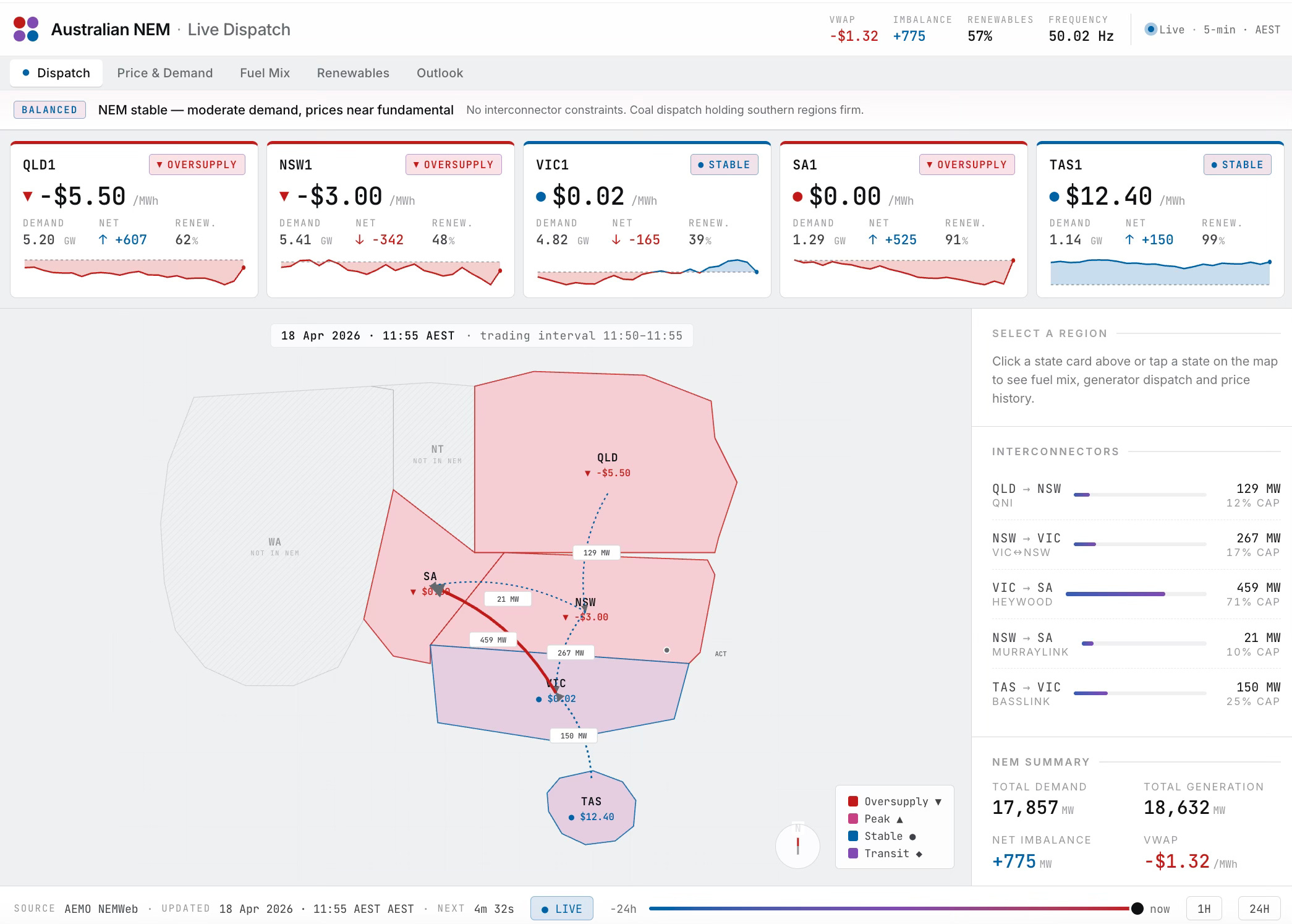
Redesigning AEMO NEM Overview Dashboard with Claude Design
If you work in energy in Australia, you know AEMO, the Australian Energy Market Operator. They run the National Energy Market. They publish live data. If you’re an analyst, you’ve probably stared at their Dispatch Overview dashboard at some point.
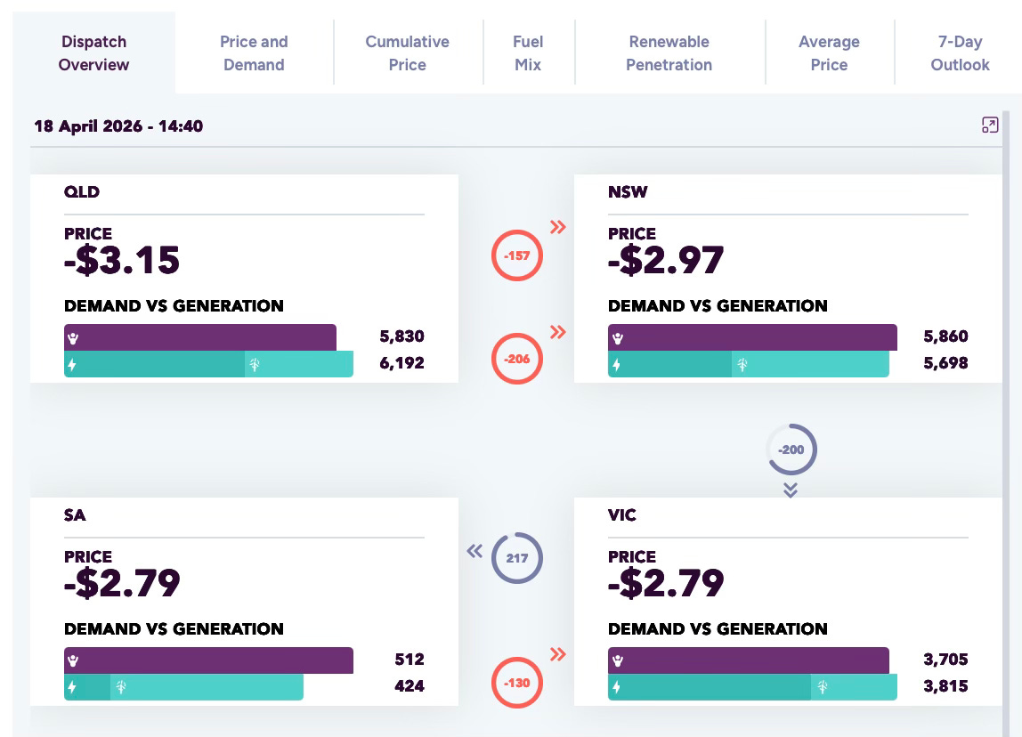
It’s a control panel for the grid. Five Australian state regions (QLD, NSW, VIC, SA, TAS), all connected. In real time, it shows electricity demand versus generation in each region, the current price (which swings wildly and can go negative when there’s too much power), and how electricity flows between states to keep the system balanced.
It’s genuinely important data. And it’s also arguably genuinely hard to read without specialist knowledge.
I grabbed a screenshot of the current dashboard and decided to use Claude Design as a redesign brief. I’d be specific: use strong visual hierarchy, spatial layout, and preattentive cues like colour, size and position so users can instantly grasp system conditions without raw number interpretation.
Standard visual analytics stuff. The kind of thing I do regularly.
I hit send and watched Claude Design think for about five minutes.
First Attempt: “What Is This Horrible Beast!?”
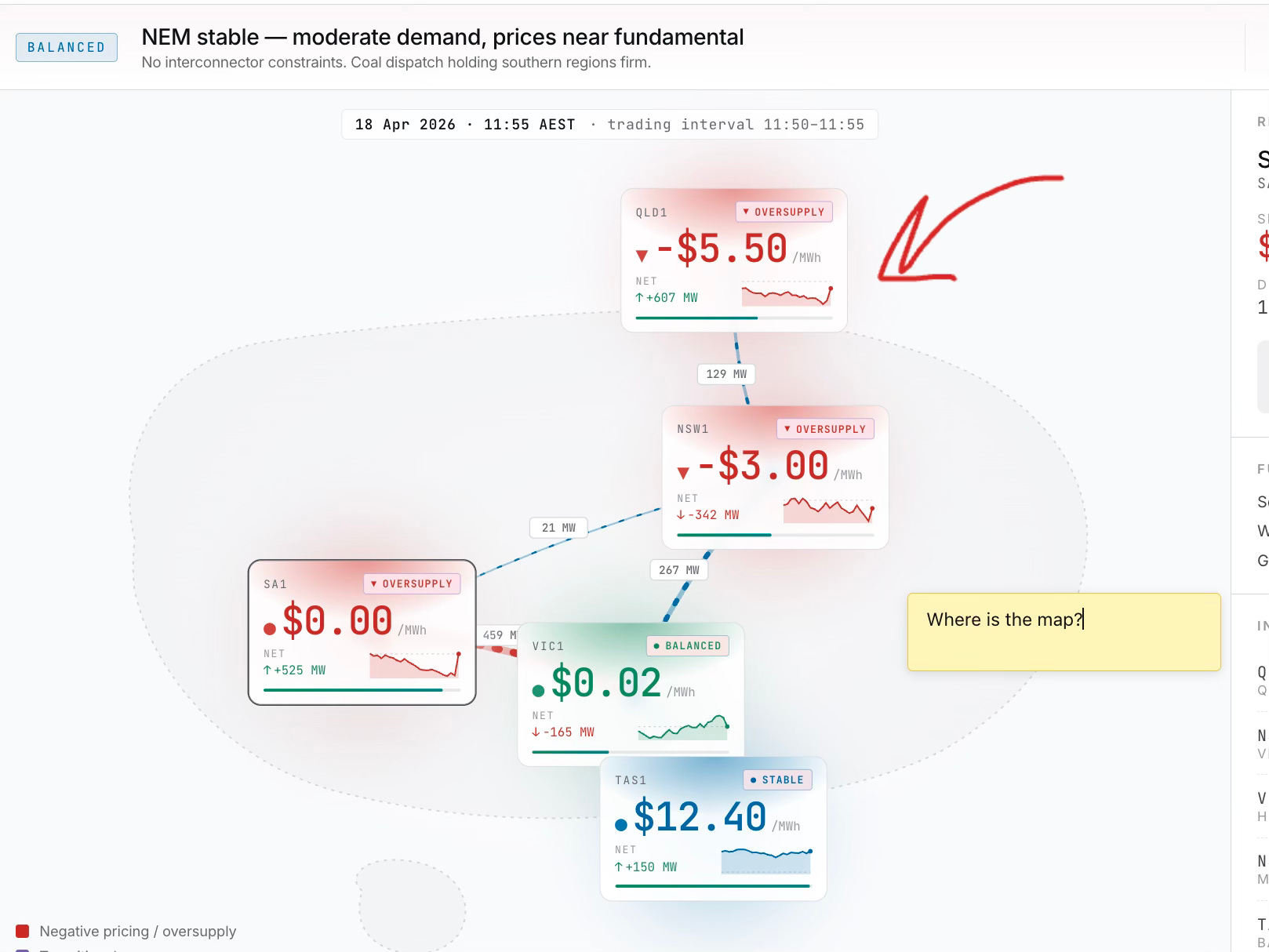
The output was initially…underwhelming. Dark mode when I’d suggested light. Colours that didn’t match my brief. A map of Australia that looked like a pink blob with overlapping state boundaries. It was the kind of thing you’d show a client and they’d say “okay, but actually no…..you’re fired.”
But here’s the thing: that maybe wasn’t Claude Design’s fault. That was my fault for expecting a one-shot miracle.
Claude Design, it turns out, is an excellent collaboration tool. You can annotate directly on the design. Draw on it. Add comments. You can ask it specific questions about why it made certain choices. It has a tweaks panel (seemingly AI-generated based on what it thinks you might want to adjust). You toggle things: dark mode, headline style, animation, density, background colours and so forth.
These abilities were not immediately obvious to me, but very clear after some rudimentary exploration of the interface.
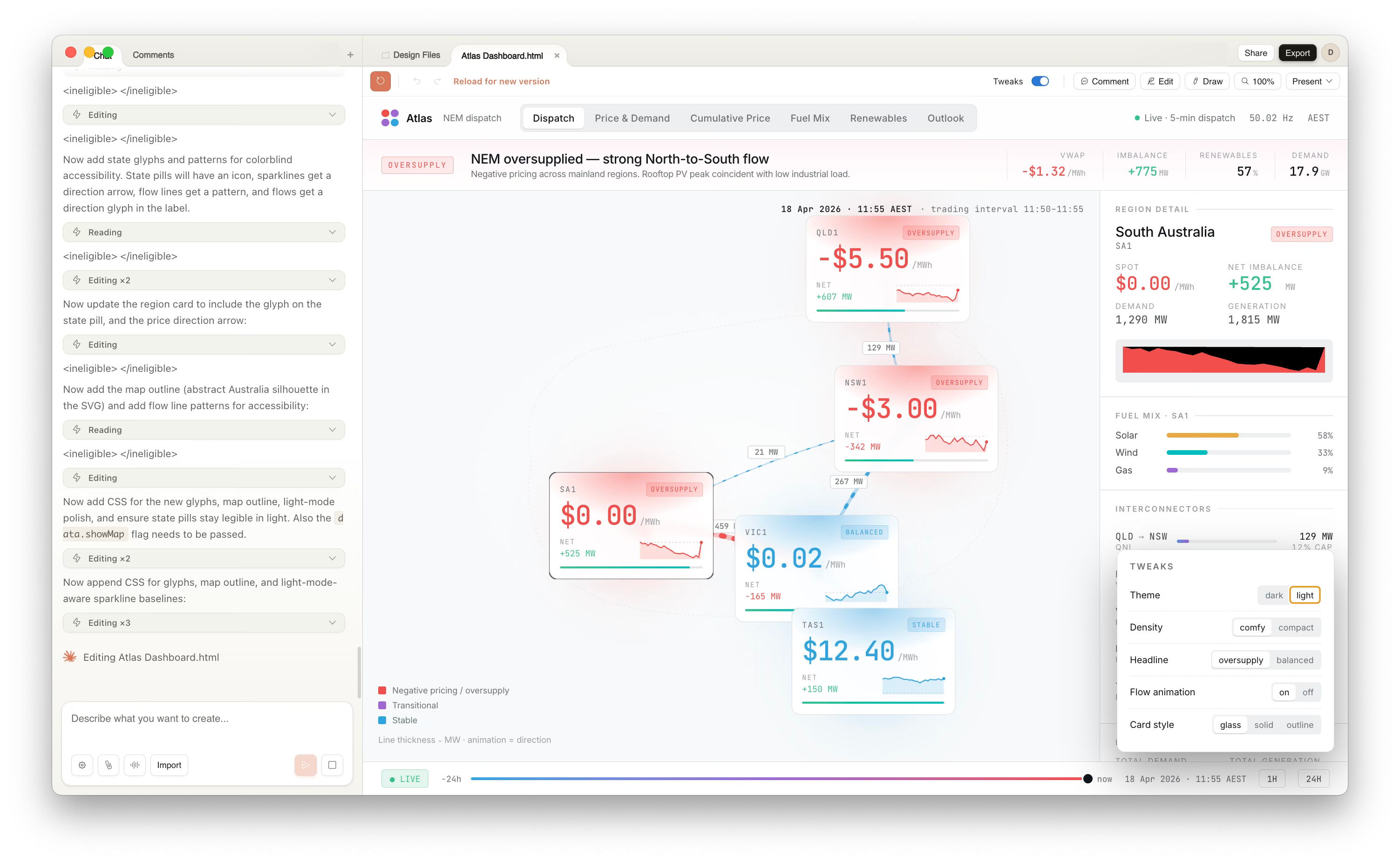
One must remember: It’s not a fire-and-forget generator. It’s a whiteboard that talks back.
Iterating My Way Out of a Pink Blob
So I stopped expecting magic and started iterating.
First issue: the map was unworkable. I explained the spatial problem.
States overlapping, coordinates wrong, doesn’t read as a network. Claude understood the note but couldn’t quite fix it. This became the running theme of the session. Claude’s spatial reasoning has limits. SVG polygon coordinates are apparently not its strong suit.
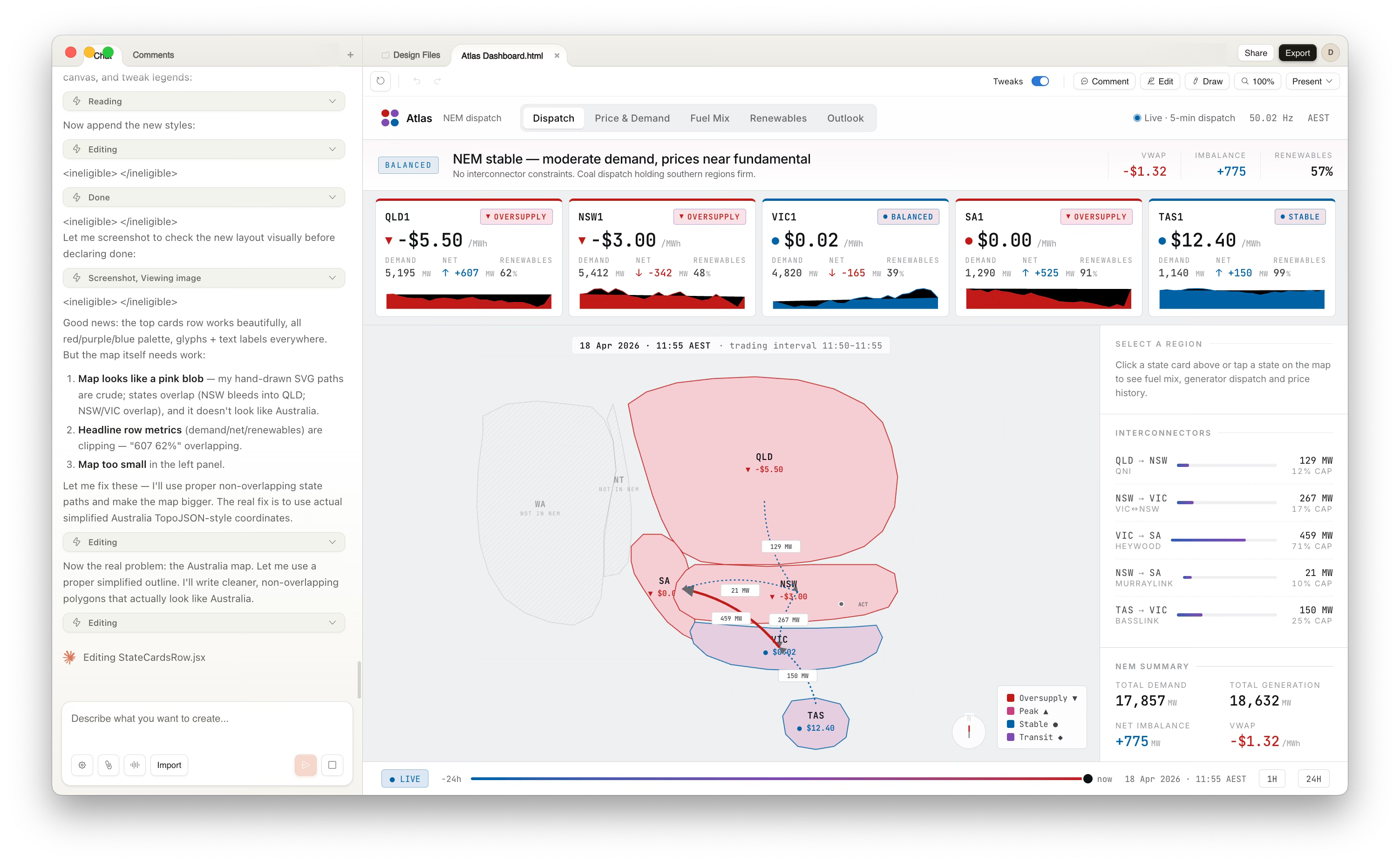
The map blob wasn’t something I could overcome in this session. But I stopped pushing on that and shifted focus to the system instead.
I reframed the brief: stop treating this like a generic business dashboard. Anchor it to geography. Make the map dominant (even if ugly), strip the top bar down to essentials, pull state summaries into a scannable row. From there: visual encoding. Colour as meaning, not decoration. Size and position to create hierarchy. Glyphs and directional arrows so you understand flow and state without relying on colour alone.
It got a bit better after some iteration.
I asked Claude Design to account for accessibility (something I’m huge on in my own work!): remove ambiguous colour choices, enforce contrast, make motion purposeful rather than cosmetic.
The iterative conversation looked something like this:
Me: “The headline is too busy. Collapse it.”
Claude: collapses it
Me: “Now add icons to the state badges so people with colour blindness still understand the status.”
Claude: adds glyphs
Me: “The map is still wrong but let’s not waste time. What if we made the region cards interactive? Click a state and show detailed info in a side panel.”
Claude: implements it
Each time, I could see the design shift in real time. Annotate. Chat. Watch it update.
The collaboration view showed everything I’d changed. Comments stacked up in the sidebar. I could revert changes, propose new directions, ask Claude to explain its reasoning on a specific element. It felt less like “prompting an AI” and more like “workshopping with a designer who happens to be very patient and very fast.”
(This won’t be much news to people who have used Figma Make, as it’s very similar).
By the third or fourth iteration, it did end up a noticeable improvement on the first effort (but still far from perfect).
The cards were cleaner. The colour palette was actually working. The interaction model made sense. It wasn’t perfect (the map was still a mess), but it was usable. More importantly, it felt like a real interface, not a mockup.
What Claude Design Did Well
The KPI cards were solid. Click one, and the right-hand panel reframes to show region-specific detail instead of system overview. That interaction pattern felt natural. It invited exploration without being confusing.
The collaboration features genuinely impressed me. You can annotate designs like a Google Doc. Draw arrows. Leave threaded comments. Share as PDF, PPTX, or standalone HTML.
For a team workshop or working with business SMEs who want dashboards, that’s genuinely useful. You can actually show this to stakeholders and get feedback without explaining “this is just a design tool, we haven’t built anything yet.” It looks real enough that people engage with it differently. You can also package up and export versions of the design.
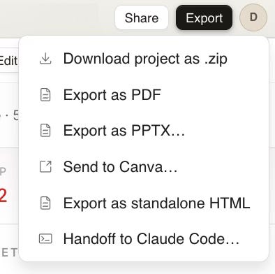
But here’s where things get genuinely interesting. You can hand off to Claude Code!
From Design to Code: The Claude Code Integration
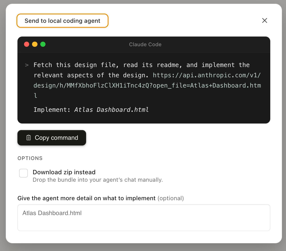
The handoff to Claude Code. This is where it gets genuinely powerful. This is where the closed loop actually matters.
You finish iterating on the design. You’ve got something you’re happy with (or at least something that’s good enough to test). You hit “Send to Claude Code,” optionally pass along additional context (”Make this interactive React component, support dark mode, keep animations smooth”), and Claude Code takes over.
Now, normally this is where friction appears. You’ve got a dashboard design brief. You need to write detailed specs. You hand off to a developer. They ask questions. You iterate on code. Two weeks pass. Something’s broken. The design didn’t translate to the UI library. The interactions are janky.
Not this time.
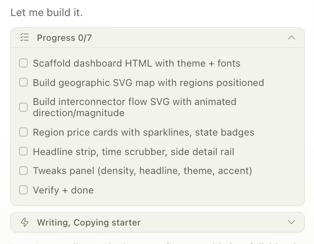
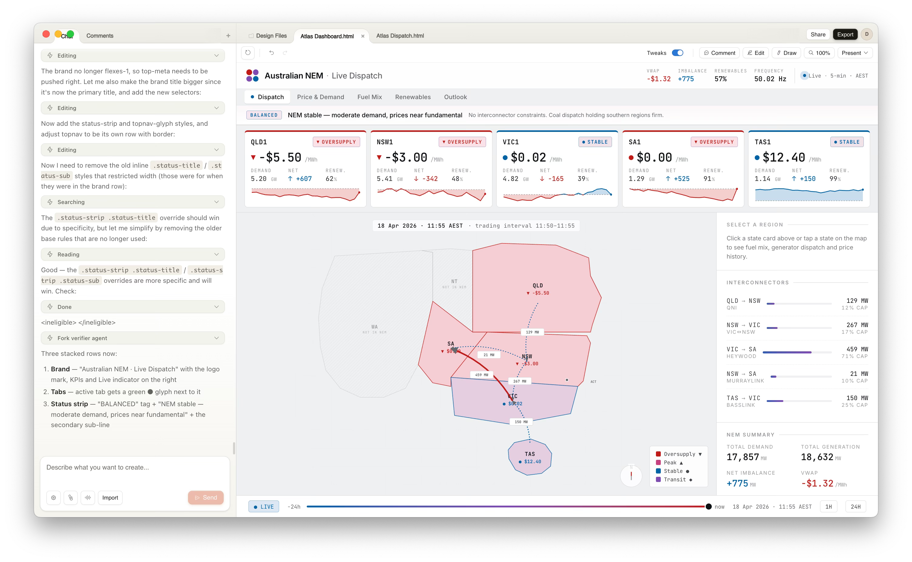
I watched Claude Code work through the build. It had a checklist: scaffold dashboard HTML with theme and fonts. Build geographic SVG map with regions positioned. Build interconnector flow SVG with animated direction/magnitude. Region price cards with sparklines and state badges. Headline strip, time scrubber, side detail rail. Tweaks panel with density, headline, theme, accent controls. Verify and done.
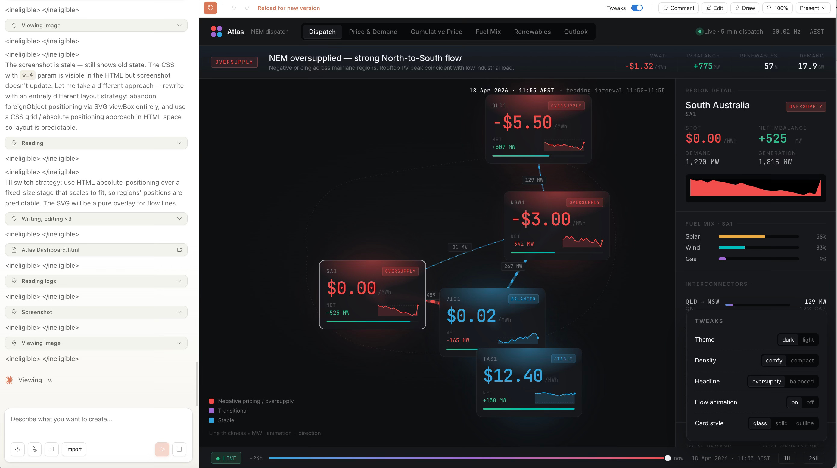
As each task completed, I could see the actual code being written. React components being scaffolded. SVG paths being rendered. Event handlers being wired up. This wasn’t a mockup. This was actual, working code.
And here is the result - a finished React dashboard that exactly mimics my design.
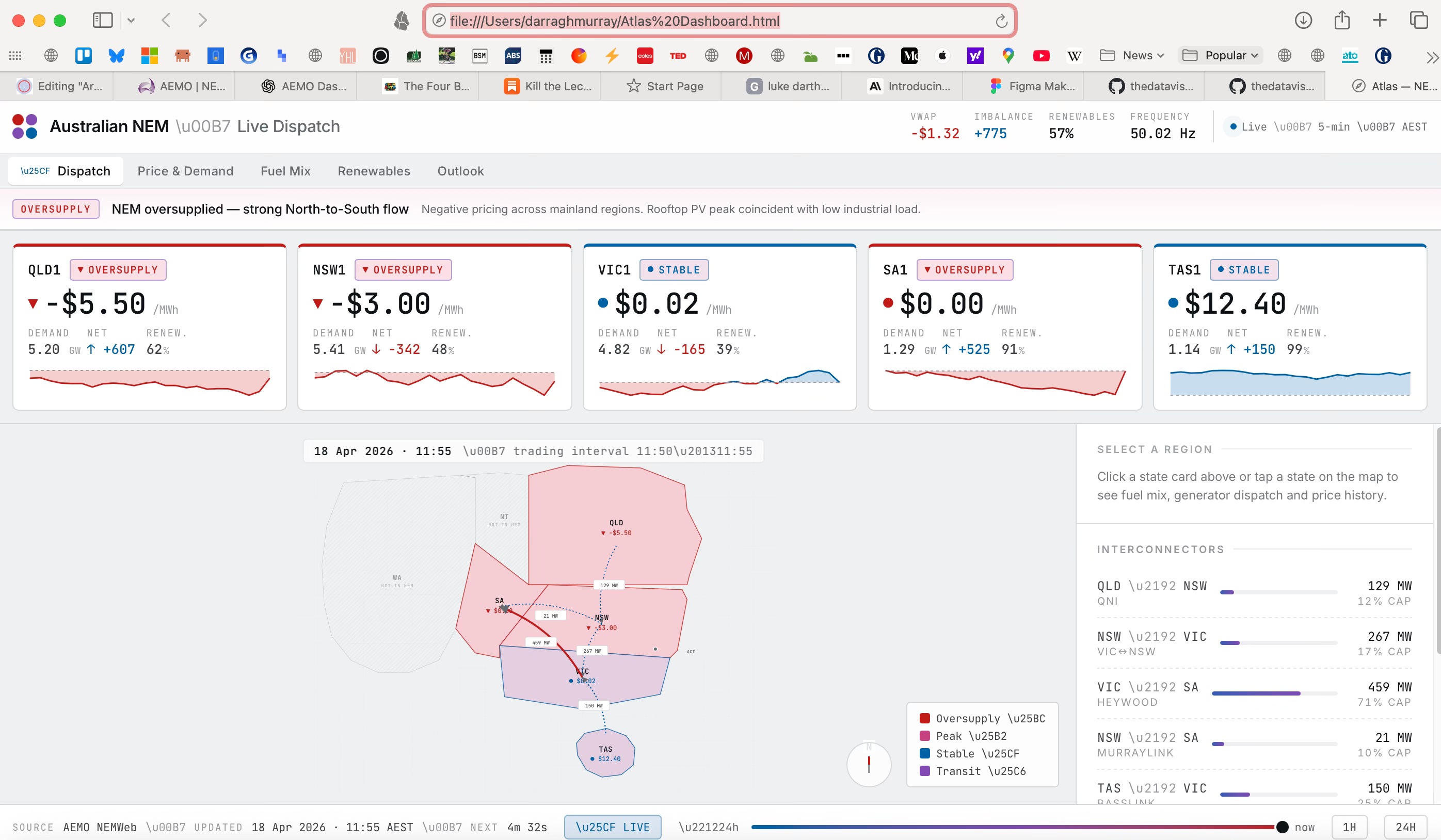
The whole process took about 30 minutes (including me figuring out how to use Claude Design). The dashboard went from design file to a fully interactive React app running in the browser. Tabs worked. State management worked. Dark mode toggled properly. The tweaks panel actually adjusted the layout. Click a region, the sidebar updates with that region’s data. All of it.
And here's the thing that actually impressed me: it seemed to work pretty much seamlessly. No broken imports. No prop type mismatches. No CSS that didn't work. The code was clean, commented, and structured sensibly. It looked like something a competent developer would write, not something an AI had hallucinated at midnight.
That’s the real story here. You can go from “I have an idea for how this dashboard should look” to “here’s a working, interactive, deployable prototype” in less than two hours, almost entirely in chat, without context switching between tools or waiting for a separate development handoff.
The friction that normally takes days is just gone.
n that normally takes days is just gone.
What Didn’t Work
Ok, so while I’m impressed, it wasn’ tall peaches and cream.
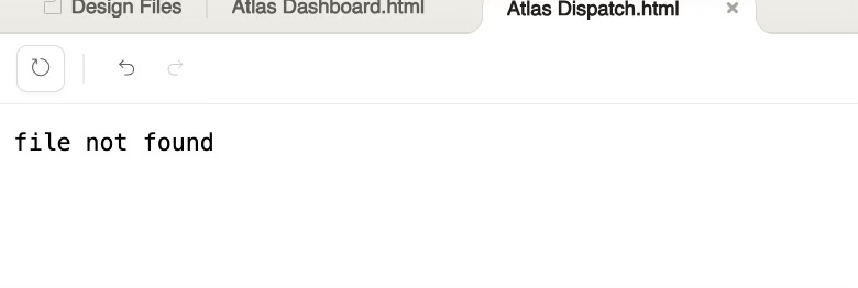
Mapping. Spatial reasoning. Anything requiring precise coordinate systems. Claude can understand the problem (”Your Australian states are overlapping”), but it couldnt’ seem to fix it in a way that actually works. It may mean means if you need accurate geographic visualisation, you’re either hand-coding the SVG or bringing in a different tool.
I also wished Claude had pushed back harder upfront on the design. When I gave it my initial brief, it should’ve asked clarifying questions: “Do you want this focused on real-time monitoring or historical analysis? What’s your primary user, grid operator or analyst? Should price be more prominent than flow?” Instead it just went ahead and built something. That works sometimes. Sometimes it wastes your iteration time.
There is a complexity curve. The first draft had too much going on. A more thoughtful initial approach, asking what to leave out, would’ve saved rounds of editing.
This is perhaps where very experienced visual analytics and dashboard designers still have a HUGE ROLE in outputting usable and interpretable products.
The Death of Dashboard Design Friction?
All of this points to something Ryan Dolley wrote recently about the four big bets shaping business intelligence. One of his bets concerned this exact use case:
“Claude will just do it. The bet here is that the category collapses. Claude can make great dashboards already. It doesn’t need specialised tooling.”
I am also making a similar bet. But the serendipitous release of Claude Design paired with Claude Code integration make me significantly more confident that this scenario will play out.
Not because it’s perfect. It’s not. The map was wonky. The spatial reasoning is limited. You still need taste and iteration and the ability to say “no, that’s ugly, try again.”
But because it works as a system.
The entire flywheel is there. You brief it. You iterate via chat and annotation. You hand off to Claude Code. You get a functional prototype in hours, not weeks.
I am not surprised Figma’s share price took a huge hit after the announcement. The market knows what’s what here.
For organisations where speed and iteration matter more than pristine design systems, where getting feedback from users quickly beats perfecting the mockup, where prototyping is cheaper than coding from scratch, this is genuinely powerful. You can test ideas. You can show clients something real instead of asking them to imagine it. You can adjust based on feedback without weeks of rework.
The economics of this are different. The timeline is different. The skillset you need is different (writing good briefs matters more than pixel-perfect design).
Is Claude Design replacing me? Not yet. But it’s definitely replacing something: the friction between “I have an idea” and “here’s a working prototype.”
And honestly, I’m probably okay with that. Less admin. More building. More time spent thinking about what actually matters instead of faffing about with export formats and developer handoff documents.
That’s worth paying attention to.
Making the idea-to-prototype timeline as frictionless and non-technical as possible is imo a dream come true (a dream that was already true to largely the same extent via different tools). I haven't tried design yet, but I'll probably dive in sooner thanks to this post.